Thursday, February 26, 2009

london autumn/winter 2009 - ann-sofie back


over the past few years, the horror and gothic genre have been one of the most influential force in fashion that is not segregated to one fashion capital. paris has rick owens and ricardo tisci. miuccia prada did her own take on the trend with her most recent menswear collection in milan. even in new york, the most commercial fashion capital of all there is rodarte. and in london, where the gothic sensibility was born and has been taken to its avant garde and conceptual heights, there is ann-sofie back. the swedish born designer/stylist who has used the gothic influence as an oeuvre since launching her signature line in 2001. this season there was a much more heightened sense of the macabre in back's collection not only because of the eerie contact lenses the models wore, but also because she noted that her main source of inspiration were cult american teen horror movies such as friday the 13th, carrie, nightmare on elm street, and holloween. that translated into slashes and rips on distressed denim and button down shirts. jersey dresses and tops with interesting cut-outs that formed overlapping patterns that resembled marks left by a knife. and lace pieces which hinted at traditional prom dresses, worn by the girls who are favorite targets amongst the silver screen's infamous serial killers. as a stylist that regularly contributes to dazed and confused and self service magazines, back understands how stylistic touches can fully elucidate a story. the powdered white faces and scary contact lenses might've been over the top, but that didn't distract the obvious point that underneath all that theatricality, there were plenty of beautiful and extremely covetable clothes.


photo: catwalking.com

Wednesday, February 25, 2009

london autumn/winter 2009 - mary katrantzou


since opening the central saint martin's graduate show last year, greek born designer mary katrantzou has established herself as a young talent to watch for her innovative use of bold graphic prints, a strong sense of colour, and a slightly surrealist sensibility executed with a vision all her own. since her graduate collection, katrantzou has continued to explore the possibilities of using digital tromp l'oeil geometric prints to enhance the silhouette of the clothes she cuts. while her graduate collection and her debut presentation last season concentrated on using blown up prints of jewelry to basically act as intended adornments, this season she was inspired by art-deco inspired illustrations of perfume bottles which she had blown up and printed on every garment she presented. ingeniously she had the neck of the bottle landing on the waist line giving the illusion of a perfectly formed hour glass silhouette. while at first glance there might be assumptions that there are hardly any differences from her first two collections, upon closer inspection one realizes that the designer is starting to slowly incorporate new ideas into her design. more specifically with new shapes. where her first two efforts concentrated on the shift to highlight the print, this time saw her playing with a softer, drapier silhouette and using the print to accentuate the movement. no doubt a lesson she learned during her tenure at sophia kokosalaki. it'll be interesting to see how this talented young designer will evolve her now signature style and use it as a foundation for future ideas or if she regretfully falls into the one trick pony trap. but for the present, no one will deny that this show has been one of the strongest and most focused collection we've seen throughout london fashion week.


photo: style.com

Tuesday, February 24, 2009

london autumn/winter 2009 - christopher kane


christopher kane burst into our collective consciousness with his explosive graduate show at central saint martins three years ago and since then he's become the darling of the london fashion scene with one of the most consistently well received shows season after season. that much lauded graduate show has been so stuck on everyone's mind that it's hard to remove the designer from the over the top sexuality of that infamous collection. but to constantly connect and expect that same spirit from kane is an injustice to the talent and flexibility the young designer has. since then he has displayed the ability to present collections with such a focused idea and so precisely executed based on themes as disparate as prehistoric times, the horror movie "carrie", or virginia wolf's "orlando" that it only strengthens the young designer's growing reputation. for his most recent collection kane took a surprising route with perhaps his most somber collection to date. the drab colour palette and the heavy menswear inspired fabrics that opened the show was a departure from his previous collections. but as the show progressed kane began to introduce the lightness that counterbalanced the heaviness of the opening sequence. slowly skirts started to appear made out of straps of velvet and organza paired with lightweight plaid and prince of wales printed knits. it all culminated with kanes signature dresses. whose ingenious construction, this time made of layered appliqued organza and geometric shaped panels will without a doubt, despite its hefty price tag, sell out in shops days after arriving. kane's talent to realize his vision, and not compromise its integrity and still manage to succeed commercially, is a testament to this young designers unique and impressive talents.


photo: style.com

london autumn/winter 2009 - armand basi one


the armand basi company was founded in barcelona in 1948 as a workshop producing high quality knitwear that sold its goods to some of the most prestigious shops in spain. however, it wasn't until 1986 when the label we now know as armand basi was officially launched as an independent fashion house. initially gaining worldwide recognition for its menswear collections, since the appointment of marcus lupfer as creative director for the womenswear division and the decision to show lupfer's youth based directional approach during london fashion week, the label started gaining a newfound recognition and credibility with new customers and influential buyers and editors. for fall/winter 2009, lupfer, like many of his colleagues, delved into the eighties as a source of inspiration. while many of his fellow designers divined the opulent excess of the "me" decade, lupfer instead decided to take inspiration from the other school of designers who at that time made the most significant contribution to the fashion world and whose groundbreaking ideas still resonates to this day, the japanese. there was a play on proportion where exaggerated shapes were used to give old classics a modern twist. cropped and boxy motorcycle jackets and over sized menswear inspired military coats were worn with voluminous pleated trousers that softly tapered down the ankles and sexy knit dresses that nodded its head to the history of the house but made modern with asymmetric draping and industrial gromets all done in a strict palette of slate grays, blacks, deep olives and khaki. while editors dubbed those watershed japenese collection from the eighties as "hiroshima chic", there was none of that apocalyptic connotations attached to these clothes. it was strong, with a masculinity that only heightened the wearer's femininity. this wasn't power dressing in the eighties sense. it was power dressing for the new millennium. the type of dressing that fits perfectly with today's unstable climate.


photo: style.com

Monday, February 23, 2009

new york autumn/winter 2009 - calvin klein


when francisco costa took over the reigns of one of america's most iconic labels, he did so by sticking close to the calvin klein formula of simple, minimalist, and easy to understand ideas based on classic american sporswear which has been the cornerstone of the company. a decision which won him accolades from buyers, consumers, and fickle fashion editors and even winning the prestigious CFDA award for designer of the year in 2006. but over the last few seasons, costa's growing confidence has enabled the designer to experiment with the classic calvin klein aesthetic mixed in with a more directional approach and architectonic sensibility. that architectural spirit is the first obvious mark of costa's signature in the calvin klein empire that can sometimes work to phenomenal results, and at other times be a bit too removed from the purity and simplicity the house is known for. this season however costa managed to inject that old school calvin klein sense of fluid movement that was missing last season with his most recent collection that played on all of the house's strengths. the coat, the garment that klein built his massive empire from was in abundance this season with asymmetric lapels and arabesque panels made from some of the most hi-tech fabrication seen during the new york calendar which fully complimented costa's futuristic vision with the cleanliness and modernity of calvin klein's minimalist ideologies. he also showed dresses with handkerchief hemlines with geometric panels and some in boiled wool stretched to look like lace that had a movement reminiscent to klein's dresses during the nineties. costa's work can sometimes feel too heavy handed, or too worked. an approach which is not conducive with the spirit of the house. but when there is a focused lightness in his hand, costa makes magic.


photo: style.com

Saturday, February 21, 2009

new york autumn/winter 2009 - rad hourani


rad hourani's unique singular vision continues its driving momentum with his latest collection with just enough added elements to enrich his expanding vocabulary. in just a short time, hourani's relentless assault of sharply tailored pieces, all in black with a gothic sensibility and rock and roll edge has earned the young designer accolades from some of the most influential people in the industry. while some criticized hourani's vision for being too consistent to the point of near redundancy after his last collection, this time around saw him experimenting with new ideas but still maintaining the brand's particular identity. the simple use of adding colour into his usual all black palette gave the collection an electric surge provided by the deep and rich navy blues he used on suede and wool. as always, jackets, coats, and trousers were the focus of the collection but he counterbalanced all that sharp and rigidity by playing with a softer line whether it be through a leather coat with soft draping folds for a lapel or capes, it gave the collection something his previous presentations never had, volume. although this collection was not an abrupt departure from his previous efforts, it does show the young designer venturing out into new territory. it might not be giant leaps, but its a small step towards the right direction.


photo: wwd.com

Thursday, February 19, 2009

new york autumn/winter 2009 - helmut lang


when helmut lang left the company that bared his name in 2005, many wondered what would happen to the label that for over a decade dictated the direction of where fashion was to go. for over a year the house lay dormant until husband and wife design team michael and nicole colovos of the denim label habitual was given the daunting task to relaunch the brand. while many were expecting the design duo to continue the high end luxury tradition of the house, everyone was surprised when they decided to reinvent the label into a brand that had more of a street wear sensibility accompanied by a more approachable price point. while the weight of lang's extremely influential work could have easily overwhelmed the designers, the simple way that they have utilized lang's trademarks such as the utilitarian details, the layering, with something a little industrial and slightly futuristic, into clothes that are always contemporary with the ease and functionality of minimalism has made the label a coveted brand for a younger generation yet still can offer pieces that customers who were devout followers of lang's work can appreciate. while the colovos' work for the house does not have the seismic impact that helmut lang had, they deserve to be applauded for bringing a new point of view without disregarding the past on one of the most influential brand of the twentieth century.


photo: men.style.com

Tuesday, February 17, 2009

new york autumn/winter 2009 - marc jacobs


over the past few seasons, whether for his own signature label or for louis vuitton, marc jacobs has presented collections so rich with visual imagery and multi references ingeniously amalgamated together like a master alchemist that it sometimes take time before it could be fully digested and for the wealth of ideas to finally become palpable. his latest offering was no exception. in an economical climate such as now it might seem out of place, or even inappropriate to send down a parade of over the top looks that was almost vulgar in its opulence. while this could be the result of stylistic touches with the over done make-up and exaggerated hair styles, the real core message of the collection is that even in these times, especially during these times, that the best way to challenge future uncertainties is with optimism. and for that optimistic spirit jacobs revisited one of the most optimistic cities in the world during an immensely opulent time, new york city. more specifically the underground club culture of eighties new york. it touched on everything from seminal new york hot spots the mudd club and paradise garage, fracesco scavulo's covers for cosmopolitan magazine, the work of his great and much lamented friend artist stephen sprouse, and the renegade spirit of eighties pop icons pat benatar, cyndi lauper, and madonna. even when he referenced the most iconic visual imagery of that decade, jacobs, as always never took inspirations too literally that it became a caricature of that time. individually the pieces were contemporary that a modern woman could incorporate to her already existing wardrobe. while the collection also drew inspirations from the works of other eighties icons such as claude montana for the silhouette and christian lacroix for the colour and prints, jacobs never used them too directly that it lost its marc jacobs identity. which is a mix of something a little crazy, fun, feminine, and a lot of sex appeal. whether it be good times, or bad times, those are the things that every woman will always be attracted to.


photo: style.com

new york autumn/winter 2009 - jeremy laing


the work of toronto based designer jeremy laing is like the ancient art of japanese origami. just like the complex folds on paper found in origami, laing produces the same delicate lines on fabric. and just like origami, there is a serene, almost meditative quality in the blissful purity of his lines. the way that laing has manipulated fabric to bend into his will, whether it be through draping or folding has been a signature the young designer has been confidently developing throughout his short career. ever since deciding to show his signature line in new york city, laing has been one of the few young designers showing in new york that has mastered the ability to evolve organically. there is no sense that the designer is in a rush to catch up on seasonal trends. his collections have a sense of continuation and expanding on ideas presented as recently as last season, or a few seasons before. he continued his exploration of soft, subtle layering from his previous collection but he also touched on his experimentation with prints. something that laing is surprisingly becoming well adept at. the last time he played so freely with prints he kept the shapes simple so as not to detract from the visual interest of the pattern. this time however he utilized prints to enhance the soft, airy quality that has become synonymous with his work. his designs always feel like a caress that envelops the woman. its never suffocating or demanding. and it is that gentle touch that makes laing a breath of fresh air in an industry full of redundant young designers.


photo: style.com

Sunday, February 15, 2009

new york autumn/winter 2009 - alexander wang


the aesthetic of young new york designers usually consists of girlish prettiness mixed with a geeky naivete that charms and endears buyers and eventual consumers through its nostalgic appeal. alexander wang however seems to be in a class all his own. it is surprising to realize that while new york is one of the epicenters of youth culture that nurtured the music of the ramones or the new york dolls, there are few designers in new york such as alexander wang who really channels the energy and rawness of rock and roll in their work. last season saw wang manage to infused his hard edge vision with a softer colour palette and softer, more voluminous shapes. this season he did a complete 180 and presented an almost all black collection with strict angular lines that drew comparisons to the lords of eighties/early nineties excess and exaggeration thiery mugler and claude montana. there was something architectonic with the cut-outs, padded shoulders, leather panels, and metal rivets that could have meant, as wang addressed, a deliberate act to focus on tailoring. while it is typical for such a young designer to exaggerate shapes as a means to show his tailoring abilities, he managed to keep it contemporary even with a slight nineties references and as always, a ton of sex appeal. the strength of alexander wang isn't really his technical skills, nor his approachable price points, it is his unique youthful sincerity and understanding of who his customer really is and what she really wants that has enabled him to stay focused and build a business that has managed to in just a few years grow exponentially and shows no signs of slowing down.


photo: style.com

new york autumn/winter 2009 - tse


its been eight years since hussein chalayan left tse, the house famous for its luxurious cashmere knits and since then the brand has seen a sharp decline in popularity. perhaps not having a recognizable name to helm the brand contributed to its dwindling reputation. the blame however could also be pointed at the decision of the powers that be to constantly change the creative director of the house. which apart from chalayan also included narcisso rodriguez and tess giberson. making the label unable to define a solid brand identity which during these times is paramount when more and more labels are popping up each season and a definitive signature is really the only thing that sets you apart from everyone else. to celebrate two decades in the business seems like the perfect time for the house to assert its presence once again. especially when there is this new renaissance in knitwear with new designers pushing the old craft to heights its never seen before. while the in-house team could've easily ventured into the avant garde territories of chalayan or new "it" knitwear designers louise goldin or mark fast, what they've managed to achieve is retain the practicality of the house but present it in a intellectual way that had references to chalayan's conceptualism mixed in perfectly with rodriguez's understanding of easy to separate american sportswear. each piece is able to stand on its own or used as building blocks that can easily integrate to an established wardrobe or be a cornerstone to build off. while these pieces are not your average staple basics, it was a smart move for the design team to take it back to where it needed to be. back to basics. hopefully, from here on, they can start to build on that and develop an identity for the house once again.


photo: style.com

Thursday, February 12, 2009

tilda swinton - another magazine spring/summer 2009


AnOther magzine - spring/summer 2009
photographer: craig mcdean
stylist: panos yiapanis

i'll admit that although i'm pretty consistent about my loyalty to magazines, there are times that i just can't bring myself to fork over my hard earned paycheque when there's a fucking celebrity on the cover. case in point the last issue of AnOther with one of the most played out celebrity on the planet, scarlett johanson. yes i too had a crush on her when "lost in translation" came out but after seeing her for two seasons in a row in those boring louis vuitton ads and then constantly seeing her face on the cover of magazines and finally seeing how horrible her acting was on "match point" i got over her right quick. so imagine how happy and flabbergasted i was when i find out that one of my most favorite magazines in the world finally put an actress worthy of a fashion magazine cover (tilda is actually tied in my number one spot along with kate blanchett) and actually have the story inside look like a high fashion editorial featuring some of today's best up and coming designers. and i'm not gonna lie, i already basically peeped the whole thing in fashionspot and lemme tell you that the whole issue is pretty much the cat's meow. jefferson hack if by some minute chance you happen to see this...I WANT TO WORK FOR YOU!!

Friday, February 6, 2009

black to the future


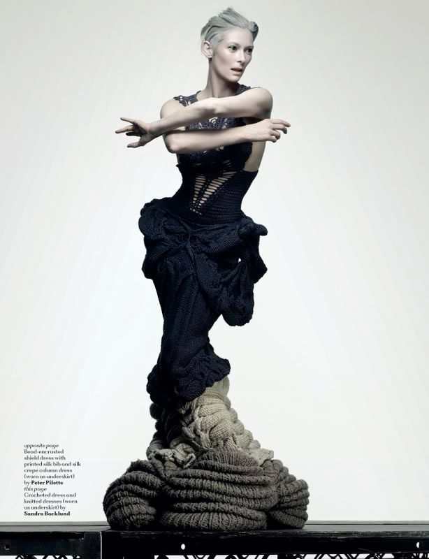
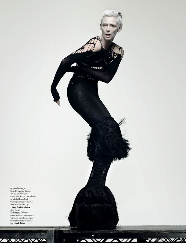
black models have always been severely under represented in the fashion industry. while models like naomi campbell, who for over the past two decades have been one, or actually the only one that have reached iconic status, she for the most part, has been the lone model of african background from the supermodel era that has enjoyed enormous fame and popularity and still be kept in high regard by some of the most influential image makers in the industry. sure there are models like jourdan dunn or chanel iman who are doing extremely well especially in these times when the vogue for beautiful classicism is in high demand, but while "directional" caucasian girls are still able to compete and even thrive in this climate, highly editorial models of colour have been few and very far in between. not since the mid nineties when alek wek commanded the attention of the fashion world with her extremely prominent african features and deep ebony skin has a model of colour been able to achieve the longevity and prominence wek has enjoyed for over a decade and still not conform to traditional connotations associated with beauty in a western, eurocentric sense. that however seems to, and hopefully is about to change.
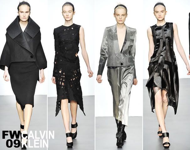
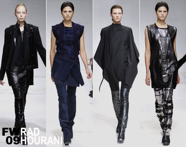
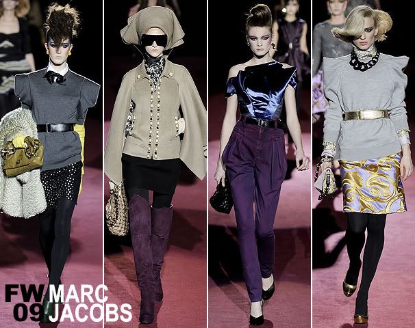
after the groundbreaking and extremely influential all black issue of italian vogue was released last summer which helped launch the careers of sessilee lopez and ubah hassan, girls who compared to the regal and feline beauty of liya kebede and jourdan dunn respectively, exposed the world to models of colour who has the face that has the versatility to lend their personality and definitve beauty in an editorial vernacular yet are able to translate to commercial territories. this upcoming season seems to be the real test on just how far reaching that watershed italian vogue issue really is.
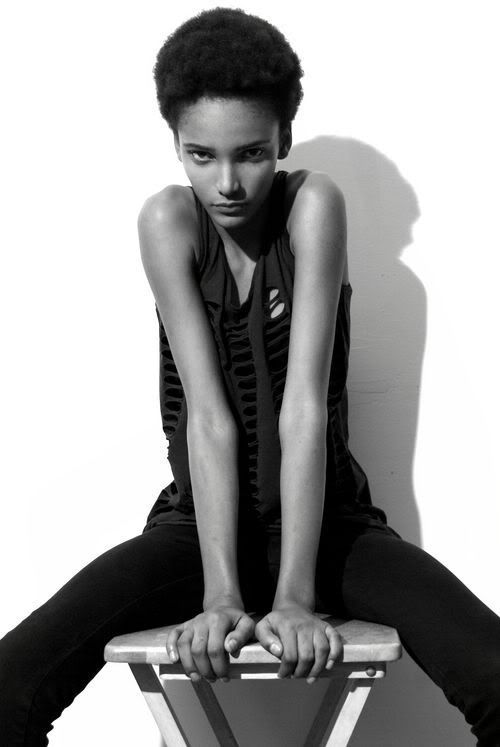
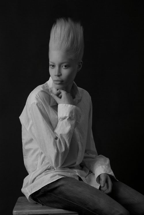
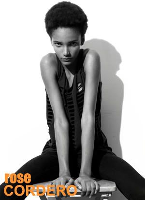
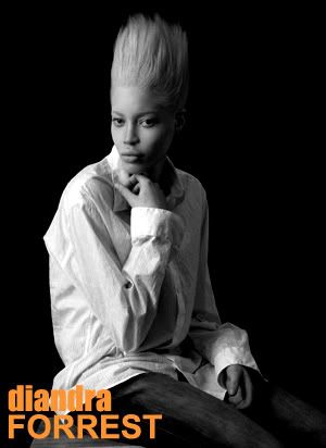
with all the hype surrounding supreme's rose cordero, the sixteen year old dominican who is the first black model since gucci campaign girl nadine willis who has been at the roster of the agency reknowned for its edgy high fashion girls and elite's newly signed diandra forrest with her haunting and beautiful albinism has the modeling world seen such models of colour who has the potential of enduring such premature hype and possibly maintain a longevity similar to successful editorial girls such as guinever van seenus or karen elson.
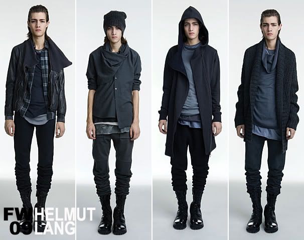
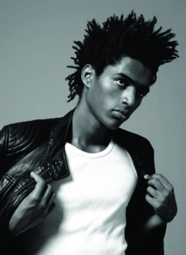
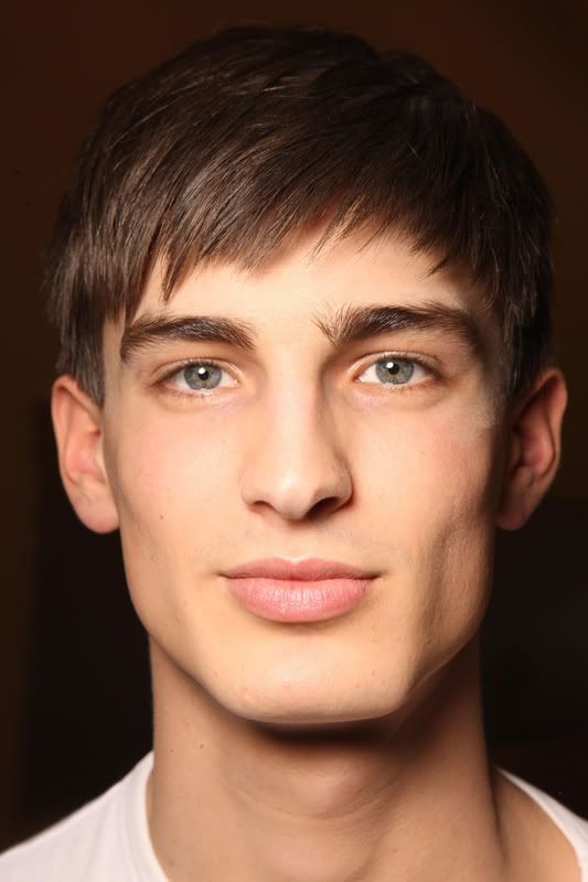
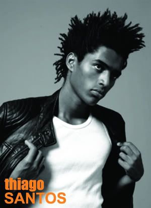
the male modeling world too is experiencing a dawning of a new age. as was evident with the most recent european menswear presentations, the need to evolve past hedi slimane's post modern and highly romanticized male image and the uber masculinity of the late eighties/early nineties seems to finally be giving way to a new breed of models who's masculinity is represented by a youthful virility devoid of any sense of hyper exaggeration or androgyny. case in point brazilian model thiago santos who opened and closed dior homme, the house that under slimane's direction dictated the image of the man of the two thousands.
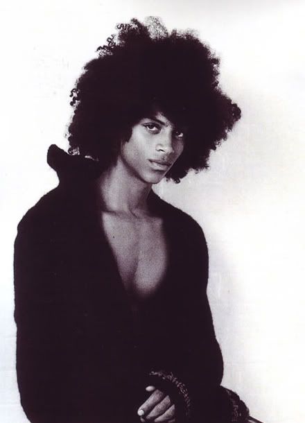
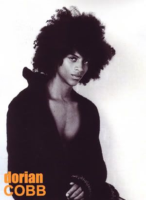
as the world progressively becomes smaller and sub-cultures that was once hovering in the peripheral continue to exhort its influence and impose its manifestos to the rarified world of high fashion, models like dorian cobb and his untamed afro who symbolizes a hip hop sensibility suddenly seems appropriate during a time when designers are trying to reach as broad an audience as they can.
only time will tell if these new crop of black models can sustain the longevity of their white counterparts. will they be able to transgress and land those high paying ad campaigns or book those highly publicized runway shows or land on those prestigious magazine covers? who knows. but the fact of the matter is that they have a chance. and that might be the most important thing of all. for now at least. happy black history month.

Tuesday, February 3, 2009

these new young puritans


after all the talks of the return to traditional notions of beauty, a debate that was strongly supported by the last womenswear collections and the resulting ad campaigns that followed which bet its multi-million dollar budgets on iconic supermodels of the past and a handful of classic looking new girls in order to appeal a wider range of audiences, the recent european menswear collections surprisingly became the launchpad for some of the freshest faces and the ones that have been hovering under the radar for the past few seasons in the male modeling world. granted that the top perennials such as mathias lauridsen, taylor fuchs, and clement chabernaud still gained the highest runway mileage, the recent fall/winter 2009 collection really belonged to a new batch of boys that is slowly redefining a youthful masculinity that for almost a decade has been stuck on the aesthetic hedi slimane perpetuated at dior homme. while these new crop of models are by no means rippling biceps and washboard abs, they don't exude a fragility nor any sense of androgyny yet still retaining a purity and childlike naiveté. trying not to use the dirty "r" word again, but in these times designers need to project a sense of inner strength, and let's face it, as foolish as youth can be, it is also the time that saw us at our bravest. in a season when it seemed like it was all about warriors ready for battle be it in a sharp grey suit at prada, a boxer in mcqueen, or as the first black president of the united states in lanvin, the virility and beauty of youth is a powerful symbol that designers have used to fully realize their vision time and time again. their faces don't look exhausted, nor does it carry a poised nonchalance, just the pure and determined look of a young man ready to make his mark in the world in all its wide eyed wonder and with the optimism that only belongs to the young.